Building a Great Data Dashboard: An Example from Vietnam
Dashboards are powerful tools for presenting data and communicating insights to your team and stakeholders. A great dashboard is not only about choosing the right platform or tool, but also about following the principles of effective data visualization and user experience design. A well-designed dashboard that is clean and unbiased can help users explore, analyze and draw insights from the data more easily. To help you help you use visuals effectively to communicate and tell the data's stories, USAID Learns has developed a data visualization checklist (available in Vietnamese and English).
In this blog post, we will give you some advice on how to design and build a great dashboard, using an example from USAID Learns support for a USAID/Vietnam partner who improved their dashboard. The data has been changed to safeguard the confidentiality of the activity data.
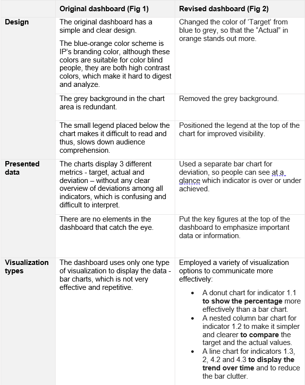
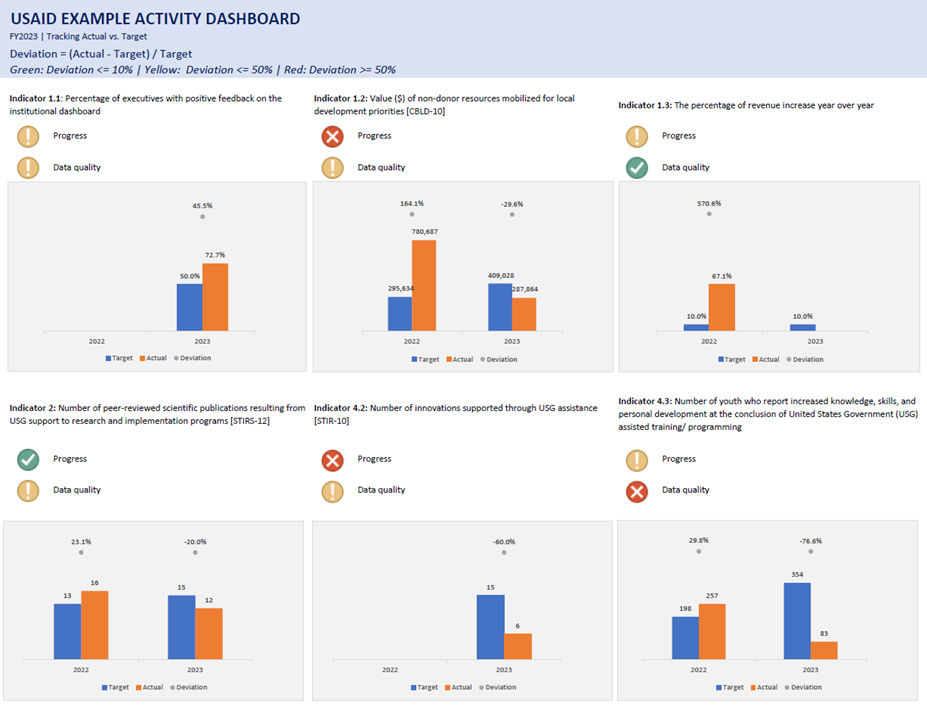
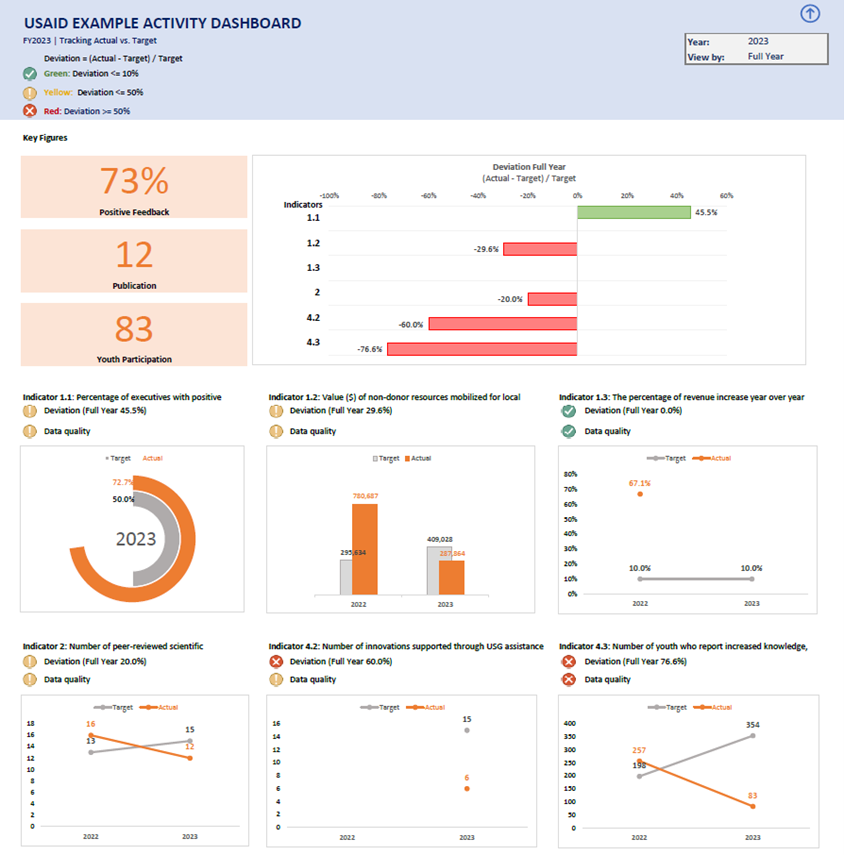
We examined the original dashboard and identified some areas for improvement. With some simple changes, the dashboard becomes much more visually appealing and informative.

Figure 1: Original dashboard

Figure 2: Revised dashboard (Please note that the data in the original version may not match the revised version because the dashboard is updated periodically)

So, our key takeaways from this case are:
- Keep the design simple and clean. Remove any unnecessary or distracting elements that do not convey data.
- Choose the right visualization type. To select an effective visualization type, you need to understand the data and especially the visual function. What do you want to show: percentage, part-to-whole, comparison or trend? Then choose the type of chart that best suits your purpose. We suggest using the chart chooser tool, but most of the time, simple and user-friendly charts like bar, line or pie work well.
- Group your related metrics - make them easy to locate.
- Highlight key features that attract your audience's attention and curiosity to explore your data.
- Use clear labels for your audience - make them short and clear.
- Don't do it by yourself. Ask for feedback from your team, keep them involved, engaged and revise any points that are not clear or accessible.
And be sure to check out our data visualization checklist (VN and EN) to help you create better visuals for your data users!


